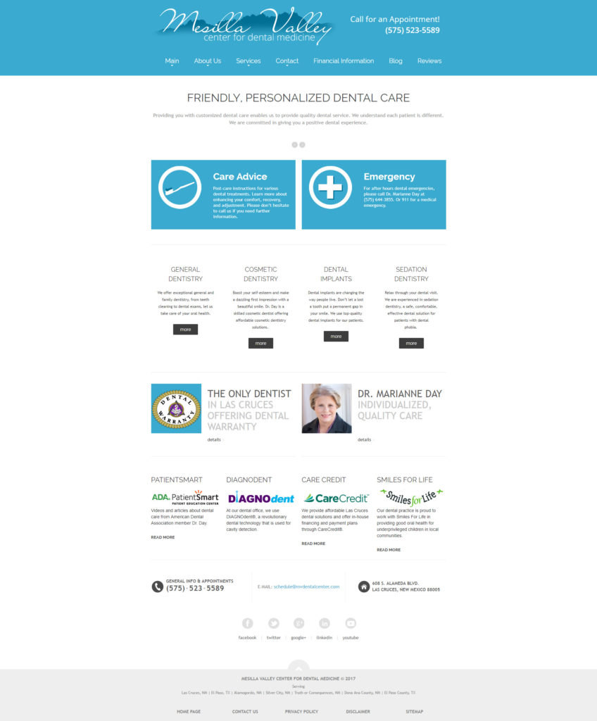
Our client was moving from a specialized dentistry SEO company that was a “one size fits all” approach. Originally, their website had tons of duplicate content and was not catered precisely to our client’s needs. Additionally, their website was not responsive and they wanted to bring in mobile users.
They came to us without a logo as well, so I designed their identity in addition to designing and developing their new website.
Materials & Time Spent
They had about 100 pages so a lot of time was spent condensing their website to around 20 pages. This, in addition to the logo design as well as the web design/development project, resulted in one of my largest projects to date.

