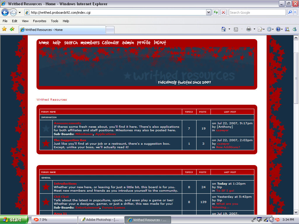
This forum design started as a challenge made to me by friend and fellow designer, Apoc, in which he said a Red/Blue layouts were not aesthetically pleasing and could not “work.” I decided to make one to prove him wrong, and this was the result.
Materials & Time Spent
Photoshop CS, CSS

