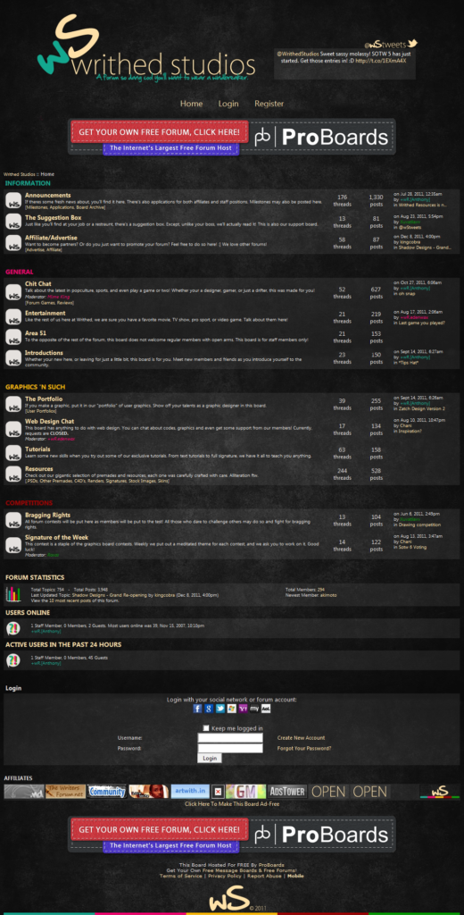
After a successful several months in version 3, I felt it was time for a fresher look. The direction under version 4 took a more “pop” vibe, as I looked for a way to appeal to the masses. This meant a multi-color color scheme. The change paid off as we saw the largest growth in membership and activity in the 3 year history of Writhed. Additionally, the name was changed from Writhed Resource to Writhed Studios, to focus more emphasis on the design community versus the freebie design resource idea originally used.
One cool element to this particular design is the banner image was set to a randomizer, and displayed different banners the 5 primary colors in the scheme. The slogan below the logo also changed.
Materials & Time Spent
Photoshop CS, CSS3

